Friday, November 21, 2008

TATA Indigo, FORD Ikon

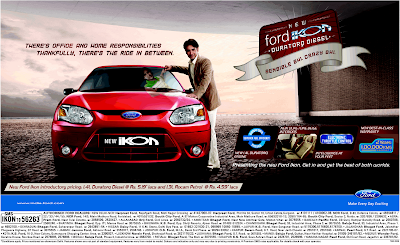
Here is the Advertisement of FORD Ikon & TATA Indigo.


See the difference between the two ads. Both target audience seams to be same. where we have seen TVC of Indigo clearly stating "in the end style does matter" but here in print ad i don't find any similarity in the ad message of TVC and print ad. However that's not the point i want to discuss. Here i want your attention towards the difference between the creative approach between the two ads, in which i feel Ford Ikon ad has overwhelm the Tata Indico ad.

The Ikon ad shows the informal mirror of the man in the formal clearly positioning car for youngster and who is looking stylish good performance car with tag line "Sensible Bhi, Crazy Bhi" which i feel is very creative approach to put your message. Where as ad of TATA Indigo seems to be too ordinary which i don't think is good enough to break the clutter. However their TVC is really good.
Saturday, November 15, 2008

PAJERO ad

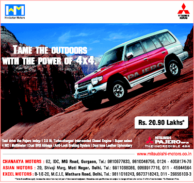
Here is the print ad of PAJERO.


Now what i see here is that even though this Ad is absolutely amazing having a good tag line "Tame the outdoors with the power of 4x4" with a absolutely fascinating pic of car but there is something very wrong in it. What i see is that the final finish is not there. Just see the header and footer where you will see logo of Hindustan Motors & Mitsubishi Motors and contacts of the dealers in Delhi. Now here the header & footer background is not contrasting with the pic and due to white colour which is of newspaper, when u see this ad in newspaper the header & footer is not looking part of this Ad.

What i mean from above is that the Ad should look complete as a whole and should not lost its part due to nearby surrounding.

Just se the Ad of Audi under and you will understand what i mean to say.